
Why I Scrapbook the Way I Do: The Power of White Space


If you've looked through my scrapbook pages, you've probably noticed something right away.
I almost always begin with Bright White cardstock.
It has become one of the most recognizable parts of my personal style, and it is also one of the things people ask me about most often.
"Don't you think it's too plain?"
"Why don't you use more patterned paper for your background?"
"Aren't you afraid the page will look unfinished?"
They're fair questions, because white space can feel uncomfortable at first. In fact, I am going to tell you something that may surprise you. In 2009 (yes, 17 years ago!), I was a Close To My Heart consultant. It was then that this thing called "white space" was introducing itself. Close To My Heart created a workshop, and oh, there was a lot of white! I complained, I moaned, and I couldn't believe that we would make such a change. But as most things, if you really want to learn and grow, you have to give it a chance. And in the years to come, I learned so many things about white space, and that's what I want to share with you today!
Many scrapbookers feel the need to fill every inch of a page. We spend good money on beautiful papers and embellishments, so it seems natural to want to use as much of them as possible. A large area of unfinished cardstock may make you feel like something is missing.
But over the years, I've learned something important: White space isn't empty or wasted space. It is purposeful space.
It gives our eyes a place to rest. It creates contrast and balance. Most importantly, it helps the photographs and stories receive the attention they deserve.
I do not use white cardstock because I believe every scrapbooker should design the way I do. There are many beautiful approaches to memory keeping, and a patterned-paper background may be exactly right for someone else’s style or for a particular story.
I use white because it supports the way I want my pages to feel: clean, focused, timeless and centered on the memory. I also truly believe it's one of the most powerful design tools we have.
What Is White Space?
Before going any further, it may help to explain what designers mean when they use the term white space.
White space does not necessarily have to be white. It simply refers to the open or less-decorated areas surrounding the main elements of a design. A pale blue background, a soft neutral paper or even a quiet section of patterned paper can function as white space.
On my pages, however, it often really is white because Bright White cardstock has become my favorite starting point.
White space is the breathing room around the photographs, journaling, paper and embellishments. It helps separate those elements so that we can see and appreciate them individually. It also helps connect them into one organized design rather than making the page feel like a collection of unrelated pieces.
Think about the margins around the words in a book. Without those margins, the page would feel crowded and difficult to read. Or the framed photograph hanging on a wall. The open wall surrounding it helps the photograph stand out. A scrapbook page works in much the same way.
White Space Gives Your Eyes a Place to Rest
When every inch of a layout is filled with patterns, colors, and embellishments, your eye doesn't know where to look first. If every area of the page carries the same amount of visual weight, our eyes may not know where to begin. We move from one element to another without finding a clear focal point.
With white space, there is a lot of quiet space and instead of competing for attention, every element has visual breathing room. Your eyes naturally settle on what matters most, and the page feels calmer rather than overwhelming. What might be considered empty space allows you to appreciate the photos, read the journaling, and taking in the beautiful embellishment.
This creates a bigger impact. A detailed cluster feels more special when it is surrounded by calm. A title becomes easier to read when it is not competing with a busy background. Journaling becomes more inviting when the eye can find it easily. White space allows all of those elements to be enjoyed rather than simply noticed.
White Space Creates Balance
Balance does not mean that both sides of a scrapbook page must look exactly the same. In fact, many of my layouts are not symmetrical at all. Balance is the feeling that the elements belong where they have been placed and that no part of the design feels unintentionally heavy or disconnected.
A large photograph may carry significant visual weight because of its size and color. A dark patterned paper can also feel heavy. A large flower cluster or title may draw strong attention. If every section of the layout contains an element with that same intensity, the page may feel crowded. Open space offsets that visual weight.
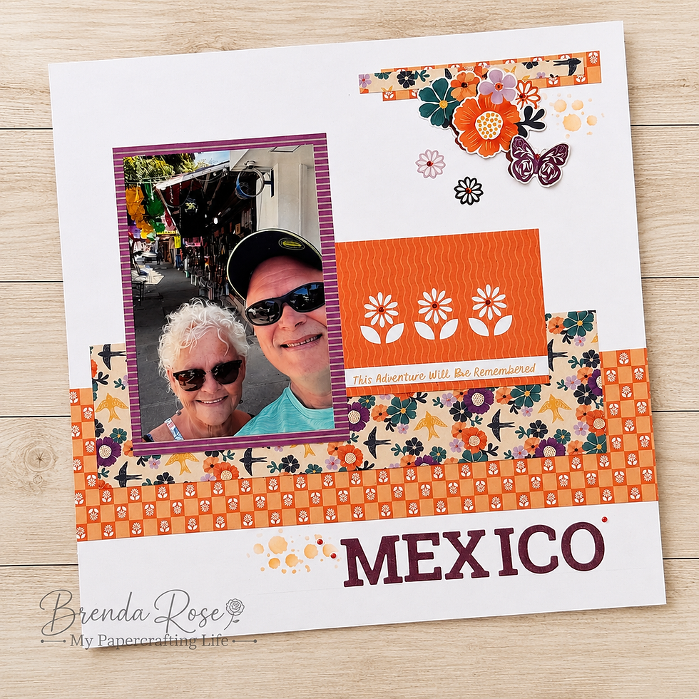
For example, I may place a strong cluster of photographs and paper toward the center or one side of the page. Rather than adding another equally large cluster to the opposite side, I may leave more cardstock visible there and add only a small accent. The open area provides balance without needing to repeat everything.
This is one reason I often use diagonal or triangular embellishment placement. A larger cluster near one corner can be visually connected to a smaller cluster on the opposite side. The white space between them becomes part of the movement across the page. The layout feels complete, even though every inch has not been filled.
White space can also help balance color. When I use a paper collection with strong or varied colors, the white background keeps those colors from becoming too intense. Each shade has room to stand on its own, and the overall page feels lighter. For me, that balance creates a peaceful feeling. It allows me to use colorful products while still creating the clean look I love.
White Space Gives the Photos the Spotlight
When I design a scrapbook page, I ask myself one question before anything else:
"What do I want my family to notice first?" For me, the answer is always the photographs.
Those pictures capture the people I love, the adventures we've shared, and the moments I never want to forget.
The paper is beautiful.
The embellishments are fun.
But they're supporting actors. The photos are the stars of the show. And I think sometimes we forget that the purpose of a scrapbook isn't to showcase our supplies. It's to preserve the people we love and the stories that make them unforgettable.
A clean white background naturally draws your eye toward the photographs without distraction. That's exactly what I want. It may be created through size, color, contrast, placement or a combination of several design choices. White space is especially useful because it creates contrast without requiring me to add another product. It says, “Look right here. This is the heart of the page.”
Without a clear focal point, viewers may notice the patterned paper first, then an embellishment, then a title and only later discover the photographs. There is nothing necessarily wrong with that, but it is not what I want for my albums.
I want someone to open the page and immediately see the people or the moment being preserved. White space helps me make that happen.
White Doesn't Mean Boring
Let me tell you what I see in white paper because to me, it is a blank canvas full of possibilities!
I LOVE patterned paper!
I love patterned paper, and I use a lot of it! Using a white background does not mean I am trying to avoid designer papers at all! In fact, I believe white space can make patterned paper even more effective.
When a pattern covers the entire background, it becomes part of the overall atmosphere of the page. I will always suggest light tonal papers for a background so that you have that blank canvas.
I really enjoy collections that contain large, bold or pattern-heavy designs. I do not have to choose between using the paper and keeping my photographs visible. I can cut the pattern into smaller pieces, use it as an accent, or isolate the part of the design that best supports my story.
White cardstock gives me control over how much pattern enters the page. That is especially helpful when the photographs already contain many colors, busy backgrounds or detailed scenery. Adding a full sheet of patterned paper behind them may introduce one more layer of visual activity. White creates separation and gives both the photos and the paper room to be seen. Rather than competing with each other, they begin to work together.
And what do you do with embellishments?
Oh my goodness! Embellishments are among the most enjoyable parts of creating a scrapbook page. They add texture, dimension, personality and charm. They can reinforce the theme of the photographs or simply add beauty to the design. But more embellishments do not always create more impact.
A small, thoughtfully arranged cluster can attract more attention than stickers scattered across the entire layout. White space helps define the cluster and makes each piece within it easier to appreciate.
When I create an embellishment cluster, I grab my 3-D foam tape and often combine different sizes, shapes and textures. I may layer flowers with leaves, stickers, punched pieces, gems or twine. Because the cluster sits against a clean background, the details remain visible. The white space around it creates a boundary without requiring an actual border.
It also helps the cluster feel connected to the photographs. Rather than placing embellishments in random open areas simply because the page looks empty, I try to position them where they support the main design. They may overlap a photo mat, tuck behind a strip of paper or lead the eye toward the journaling. This makes the embellishments part of the storytelling structure rather than separate decorations.
One of the lessons white space has taught me is that I do not have to use every piece I love on one layout. Sometimes removing one flower, sticker or punched shape gives the remaining elements more power. That can be difficult, especially when all of the embellishments are soooo fun! Editing, however, is part of designing.
And then there's ink and stencils...
One of the things I enjoy most about working on white cardstock is that it gives me a beautiful canvas for subtle techniques. White does not have to remain completely untouched. I may blend ink softly into a corner, stencil lightly behind a cluster, splatter color across part of the background or edge a piece of paper to give it definition. These details help personalize the page while preserving the open feeling I want.
Stenciling can add quiet pattern and texture. When I place it partially behind the photographs or embellishments, it looks as though the design continues underneath the layers. It adds interest without becoming a separate focal point.
Splattering gives the page energy and keeps a clean layout from feeling too formal. A few small droplets can visually connect different areas of the design. The key word in all of these techniques is subtle.
I want the ink to enhance the page, not become the first thing someone notices. I usually select colors that coordinate with the photographs or papers, and I apply them with a very light hand.
The white background makes even a small amount of ink visible, so I do not need to use much.
These techniques also allow me to create variety while continuing to use the same dependable cardstock foundation. Two layouts may both begin with Bright White cardstock but feel completely different because of the colors, placement and techniques added to them.
My Goal Isn't to Fill the Page
This may be the most important lesson white space has taught me: a scrapbook page can be finished without being full.
A page is finished when the design feels balanced, the photographs are supported, the story has a place and the details add meaning. None of those things require every inch to be covered.
Sometimes we continue adding because we are waiting for the page to announce that it is complete. But layouts do not always give us that clear signal. The best advice I have is to walk away from a page for a minute and then come back and look at it with fresh eyes. At some point, we have to decide that the memory has been honored and the design has done its job.
That decision becomes easier when we understand that open space has value. It is not the absence of design, but a part of the design.
The space around a photograph can be just as important as the mat beneath it. The quiet area beside the journaling can make the words easier to read. The open corner across from a cluster can create balance that another embellishment would disrupt.
Why I Continue to Choose White
After 36 years of creating scrapbook pages, white cardstock is now the background I reach for most often. It is not a rule I expect anyone else to follow, nor is it the only way to scrapbook. It is simply part of the creative language I have developed over time starting with that white space background I complained about 17 years ago!
My white backgrounds reflect what matters to me as a scrapbooker: clarity, intention and room for the memory to breathe. The page does not need to shout in order to be meaningful.
Sometimes a quiet background tells the story best.
White space is not unfinished. It is intentional.
And for me, that intention is the best way to keep the focus exactly where I want it - on the people, the memories, and the stories I'm preserving.


Comments