
Bold Patterns, Balanced Design

The Free Spirit collection is filled with bold color, strong patterns and plenty of personality—and I love all of that! But when you are working with papers that have this much going on, it can be easy for the photos to get lost in the design.
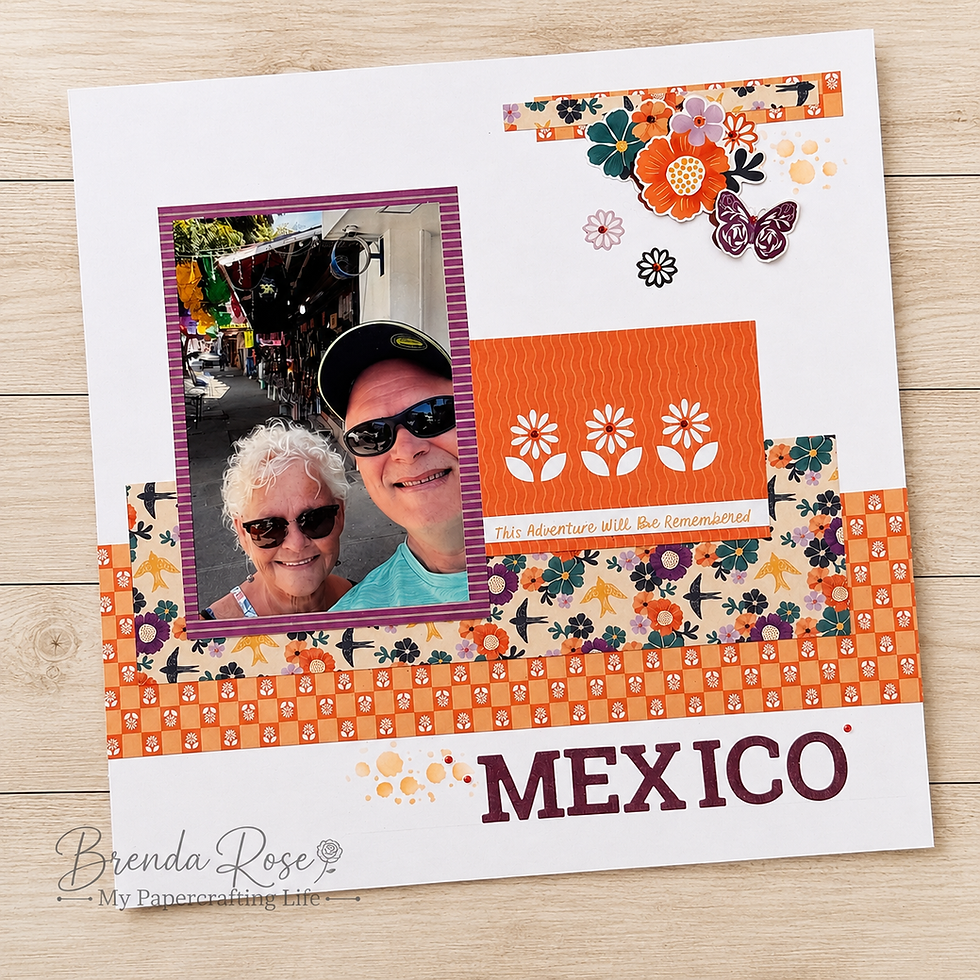
For this page, I wanted to embrace those beautiful patterns without allowing them to take over. The solution was simple: give them plenty of white space.
By starting with a white background and using the patterned papers in controlled sections, I was able to enjoy everything I love about Free Spirit while still keeping the photo as the star of the page. The white cardstock gives your eye a place to rest and makes each colorful element feel intentional rather than overwhelming.
Design Notes
Across the lower portion of the page, I layered two strips of Free Spirit paper—a 12" x 3" orange patterned strip with a 10" x 3" floral strip layered over it. Even though both patterns are bold, limiting how much of each one appears on the page keeps them from competing with the photo.
The large area of white surrounding those papers is just as important to the design as the patterned paper itself. White space doesn't mean the page is unfinished or needs something more. Here, it acts almost like a frame around the colorful elements and gives the entire layout some breathing room.
I repeated the colors and patterns from the bottom of the page in the cluster at the upper right. Free Spirit stickers, small scraps of patterned paper, Tangelo ink and the Distressed Elements stencil come together to create a cluster that feels connected to the rest of the layout without requiring another large section of patterned paper.
The title, MEXICO, was created with the Uppercase Block Serif die-cut letters and purple shimmer paper. That little bit of shimmer gives the title some presence while the purple pulls color directly from the patterned paper and photo mat.
Finally, I added a small amount of Tangelo ink with the Distressed Elements stencil to the left of the title. It is a tiny detail, but it serves an important purpose. The upper-right cluster carries quite a bit of visual weight, and the ink near the title helps balance that area diagonally across the page.
Tips & Techniques
Let white space tame bold paper. You don't have to avoid a collection because the patterns feel busy. Instead, use smaller portions of those papers against a neutral background. You still get all that wonderful color and personality without overwhelming your photos.
Repeat instead of adding more. The scraps in the upper cluster repeat papers already used elsewhere on the page. Repetition creates unity without introducing another pattern or color that your eye has to process.
Build clusters with different textures. A cluster doesn't have to be made entirely from embellishments. Combine stickers, paper scraps and stenciled ink. Those different layers add interest while keeping the cluster coordinated with the rest of your page.
Use color to move the eye around the layout. Notice how the purple appears in the photo mat, embellishments and title. The orange appears in the paper, flowers and stenciling. Repeating colors in different areas encourages your eye to travel around the page rather than stopping in one spot.
Balance doesn't have to mean matching. I didn't create another large embellishment cluster beside the title to match the one at the top. A simple touch of Tangelo ink and stenciling was enough. Sometimes the smallest detail can provide exactly the visual weight you need.
This page is a good reminder that bold patterned paper and white space aren't opposites—they can be wonderful partners. You can enjoy those beautiful, energetic patterns while still creating a page where the photograph and the memory remain the focus.


Comments