
Putting Your Photos First with the Free Spirit Collection

There are some paper collections that immediately spark creativity, and Free Spirit is definitely one of them! Filled with bold patterns, rich colors and playful details, this collection invites you to create pages with personality while still letting your treasured memories shine.
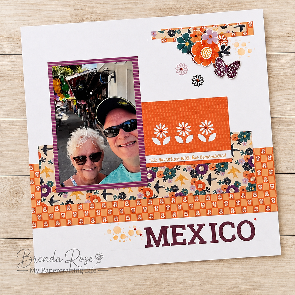
For this layout, my goal was to show that even papers with vibrant designs can be used in a clean, balanced way. By combining strategic placement, plenty of white space and a few mixed-media techniques, the patterned papers become beautiful accents that naturally guide your eye toward the photos.

Design Notes
One of my favorite design choices on this page is using the patterned papers as large diagonal elements in opposite corners. This creates movement across the page and gives the layout a fresh, modern feel without overwhelming the photographs.
Notice how the generous white background provides the perfect "breathing room." Instead of covering the page with pattern, the white space allows the colorful papers to make a statement while ensuring the photos remain the focal point.
The three photos are matted in soft purple cardstock that coordinates beautifully with the collection. Repeating that purple throughout the layout—in the mats, embellishments and title—creates unity and helps tie all of the elements together.
I also love incorporating a mat card into my layouts for journaling. Not only does it coordinate perfectly with the collection, but it also gives you an attractive place to preserve the story behind your memories. Decorative embellishment clusters frame the title and journaling without distracting from the photographs, adding just the right amount of detail and dimension.
Tips and Techniques
One of the newest products featured on this page is the Stars Stencil, and I couldn't be happier with how it complements the Free Spirit collection. I softly blended ink through the stencil in the upper left and lower right corners to create visual balance across the page.
To add even more texture, I finished those areas with coordinating ink splatters. The combination of stenciling and splattering creates interest without feeling heavy, giving the layout an artistic touch while keeping the overall design light and open.
If you're working with bold patterned papers, remember this simple design tip: you don't have to use the entire sheet. Cutting the papers into geometric shapes or design panels allows you to enjoy the beautiful patterns while controlling how much visual weight they carry on your page.
Free Spirit is such a joyful collection, and I hope this layout inspires you to embrace those colorful patterns with confidence. Sometimes all it takes is a little white space, a touch of ink, and a few thoughtfully placed embellishments to create a page that is both vibrant and beautifully balanced. Grab the PDF below to create this page. Happy scrapbooking! 💜


Comments